Fast Stop
Gas Stations / Truck Stops / Convenience Stores


Project Details
-
The rebrand had to happen because Fast Stop is rapidly growing, and as a result, it cannot remain in an inconspicuous position with an unprofessional and unrecognizable logo mark that lacks recognition and cannot serve as a starting point for branding.
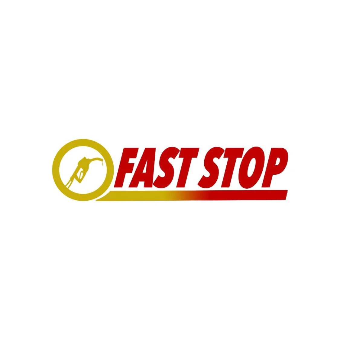
A fresh and modernized logo mark has been created, presenting a clear rebranding of the previous design. The new logo incorporates updated colors, typography and takes a more professional approach, enhancing the overall circular concept. -
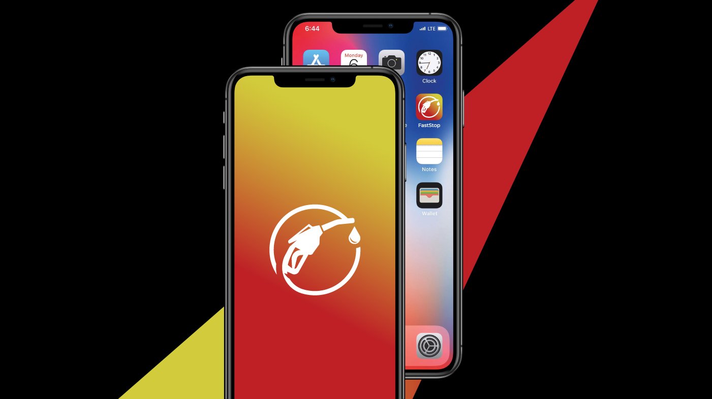
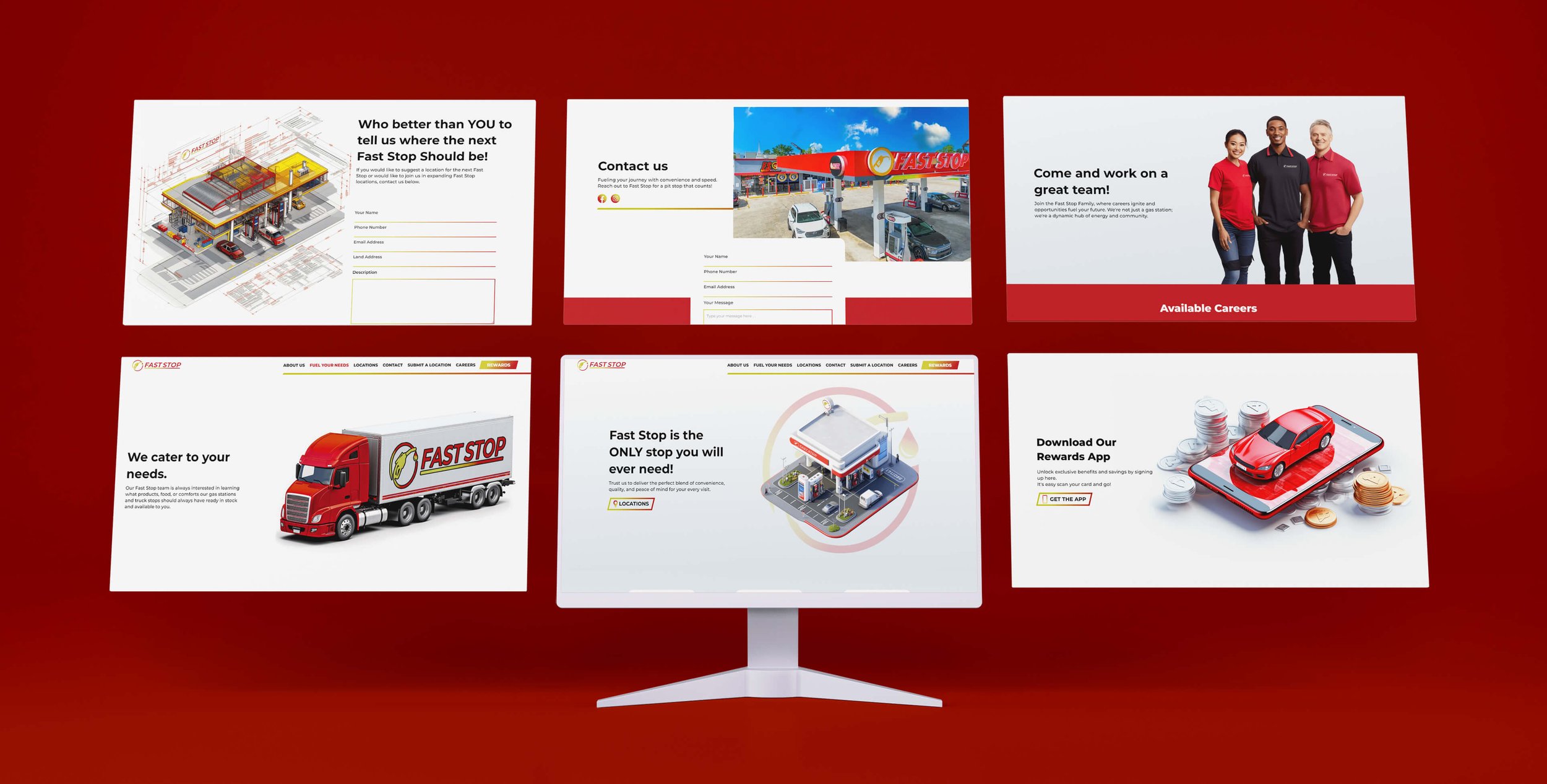
The website features a clean layout with a consistent color scheme, predominantly using white as the primary color to provide a spacious and uncluttered feel. This is complemented by strategic use of red accents, which draw attention to key elements such as call-to-action buttons, enhancing visual saliency and guiding user interaction.
High-quality images and concise content sections highlight Fast Stop's services, including their convenience stores, award-winning food, and premier gas options, providing visitors with a comprehensive understanding of the brand's offerings. -
As part of Fast Stop's rebranding efforts, we designed a cohesive suite of stationery and print materials that seamlessly aligned with their refreshed brand identity. From sleek business cards to professional letterheads and envelopes, each piece was meticulously crafted to reflect the brand's modern and approachable vibe.
-
To ensure Fast Stop's new look remains consistent across all platforms and touchpoints, we created a comprehensive, multi-page brand guidelines document.
This guide details the proper usage of the logo, color palette, typography, and imagery, ensuring every element aligns with the refreshed brand identity. It includes specific instructions on tone and style, logo placement, and best practices for print and digital materials.
Previous Branding
The rebranding of the logo mark was approached with care, as the owners were emotionally invested in the original design.
While keeping its essence intact, we introduced subtle yet meaningful refinements to improve clarity and brand recognition. The previous icon suffered from poor execution and lacked visual impact, which limited its effectiveness.
Given that Fast Stop is primarily a fuel service provider, our goal was to ensure the logo clearly reflected the nature of the business. The final design delivers a more recognizable and purposeful identity, helping customers quickly connect the logo to the services offered.

Ongoing Collaboration
Following the success of our initial project with Fast Stop, we’ve continued to build a
strong and ongoing partnership.
We're proud to provide monthly visual solutions tailored to their evolving needs.
To date, we’ve completed over ten diverse projects, from full website design to
custom-branded napkin dispenser slips, demonstrating our ability to scale
creatively across both digital and physical touchpoints.