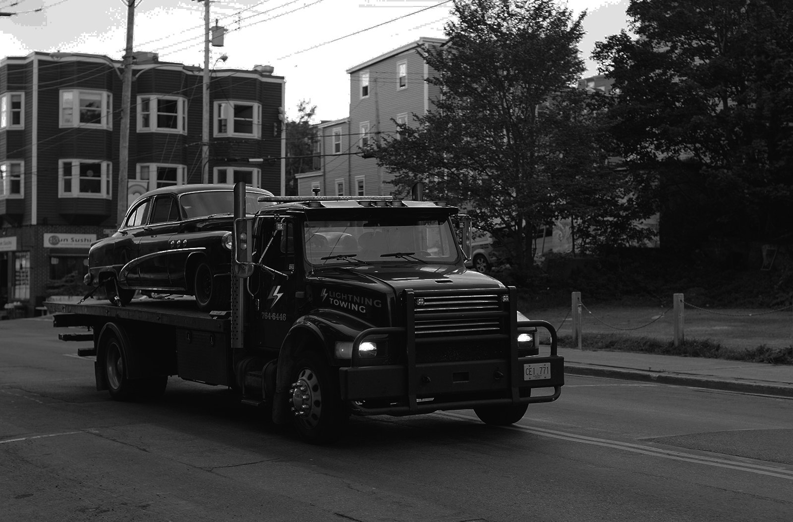
Lightning Towing
Towing Service


Project Details
-
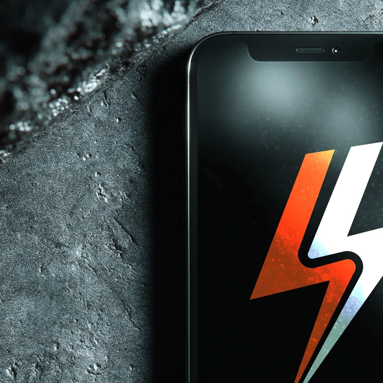
The Lightning Towing logo was designed to instantly communicate speed, strength, and reliability. The bold lightning bolt icon cleverly incorporates a road running through its center symbolizing the brand’s core service and fast response time.
The use of high-contrast orange and white on black enhances visibility and conveys urgency, while the strong, geometric typography reinforces a sense of dependability and professionalism.
The result is a modern, impactful identity that’s easily recognizable on vehicles, signage, and digital platforms. -
We created a detailed guide to help the clients future brand consistency.
This document outlines proper logo usage, including spacing, scaling, and background control to ensure visibility in all contexts—from tow trucks to digital ads. It also defines a bold, high-contrast color palette and typography system designed for maximum legibility and quick recognition.
These standards help reinforce the brand’s identity across all touchpoints, ensuring that every application reflects Lightning Towing’s fast, reliable, and professional image.