Super Stop
Fuel Stations / Convenience Stores


Project Details
-
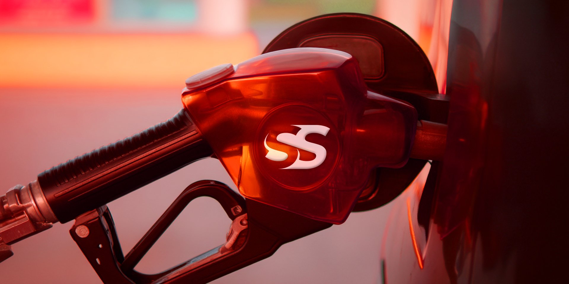
Super Stop approached us with a clear vision—to create a bold and memorable brand that captures the energy and reliability of their retail service. The result is a dynamic logo built around the powerful “SS” monogram, designed with custom curves to evoke motion, speed, and trust.
We developed two high-contrast versions: a white-on-red and red-on-white scheme, ensuring strong brand visibility across all mediums. The typeface selection complements the logo’s strength with clean, modern geometry, reinforcing Super Stop’s commitment to efficiency and modernity.
This identity system is designed to scale seamlessly from signage to digital platforms, making Super Stop instantly recognizable wherever it appears. -
The Super Stop brand guide serves as a comprehensive blueprint for maintaining a strong, cohesive visual identity.
It covers essential brand elements including primary and secondary logo usage, clear space guidelines, color specifications, and a modern, versatile type system.
The guide also includes real-world mockups and layout recommendations to demonstrate consistent application across print, digital, and environmental formats. This ensures that everyone working with the brand designers, marketers, or partners can create on-brand materials that reflect Super Stop’s bold, energetic, and professional personality.


